


The way people use websites is changing, and businesses need to keep up. Visitors expect more than attractive colors and good-looking images. They want websites that feel personal, load quickly, work smoothly on mobile devices, and make it easy to find what they need. This shift is changing how businesses approach modern website design in 2026.
From AI-powered experiences and interactive 3D visuals to bold typography and accessibility-focused layouts, the latest web design trends are making websites more engaging and useful. These changes also give businesses new ways to build trust, communicate their brand identity, and turn visitors into customers.
However, following every new design idea is not always the best approach. A trend should improve the visitor experience and support a clear business goal. For example, an online store might benefit from interactive product previews, while a professional service provider may get better results from a clean layout with clear calls to action.
Working with an experienced Website Design Company can help businesses choose the right features and build a website that balances creativity, usability, and performance.
In this guide, we’ll explore 10 important web design trends shaping websites in 2026, explain how they work, and show where businesses can use them to create better online experiences.
KEY TAKEAWAYS
- Choose trends with a purpose: Adopt design features that support your website goals, improve usability, and match your audience’s expectations rather than following every popular style.
- Prioritize mobile responsiveness and accessibility: Make sure visitors can navigate, read content, and complete important actions comfortably across different devices and abilities.
- Balance creativity with performance: Use animations, 3D graphics, and personalized content carefully to create engaging experiences without slowing down your website.
- Keep your brand identity consistent: Select layouts, typography, colors, and interactive elements that reflect your business personality and build customer trust.
- Measure results after implementation: Monitor website speed, user behavior, engagement, and conversions to understand which design changes actually improve performance.
How We Identified the Top Web Design Trends for 2026
To identify the web design trends featured in this guide, we reviewed current design industry publications, 2026 trend reports, established design practices, and examples from live business websites. We focused on design approaches that combine visual innovation with practical improvements in user experience, brand communication, accessibility, and website functionality.
Our research considered three main factors:
- Industry adoption: We examined design approaches highlighted in current industry reports and discussions among design professionals.
- User experience and business value: We considered how each trend can improve content organization, navigation, product presentation, personalization, and customer engagement.
- Practical implementation: We evaluated whether businesses can implement these approaches while maintaining website performance, accessibility, mobile responsiveness, and usability.
We also reviewed real-world website examples to understand how different brands apply these design approaches. The 10 trends in this guide represent our editorial selection based on their relevance to modern business websites, rather than a statistical ranking of popularity.
Quick Comparison of the 10 Best Web Design Trends in 2026
Before exploring the best web design trends, here’s a quick look at what makes these design approaches useful, which websites can benefit from them, and what businesses should consider before adopting them.
| Web Design Trend | Main UX Benefit | Business Benefit | Ideal Website Types | Implementation Considerations |
| AI-Powered Personalization | More relevant content and recommendations | Better engagement and potential conversions | E-commerce, SaaS, service websites | Data privacy, accuracy, and speed |
| Bento Grid and Modular Layouts | Easier content scanning | Better content organization | Corporate, SaaS, portfolios | Mobile layout and reading order |
| Kinetic & Bold Typography | Clearer visual hierarchy | Stronger brand recognition | Creative, corporate, landing pages | Font readability and loading speed |
| 3D Elements & Mixed Media | More immersive experiences | Better product presentation | E-commerce, portfolios, product websites | File size and device performance |
| Scroll-Triggered Motion & Micro-Interactions | Helpful feedback and smoother navigation | Better engagement | Landing pages, portfolios, corporate sites | Animation control and accessibility |
| Neo-Brutalism & Cute-alism | Distinctive visual experience | Stronger brand personality | Creative brands, startups, portfolios | Color contrast and readability |
| Refined Minimalism & Intentional Whitespace | Less clutter and easier navigation | Clearer messaging and stronger CTAs | Corporate, professional services, SaaS | Content hierarchy and spacing |
| Dark Mode & High-Contrast Palettes | Comfortable viewing options | Distinctive visual identity | SaaS, technology, entertainment | Contrast and theme consistency |
| Experimental & Non-Traditional Navigation | More engaging exploration | Memorable brand experience | Creative portfolios, campaigns | Navigation clarity and accessibility |
| Accessibility and Sustainable Design | Easier access for more people | Wider reach and stronger trust | All website types | WCAG practices and performance testing |
Is Your Website Ready for the Next Generation of Web Design?
An outdated website can make it harder to attract visitors and keep them engaged. From responsive layouts to interactive features, the right design improvements can transform how people experience your brand online. Identify what’s missing and discover how a modern website can help your business stand out.
Upgrade Your Website10 Web Design Trends Shaping Modern Websites in 2026
1. AI-Powered Personalization
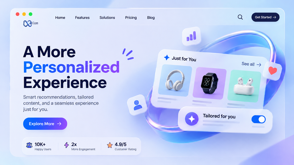
People visit websites with different needs, interests, and goals. Showing everyone the same content may not always give them the best experience. AI-powered personalization helps solve this problem by adjusting website content and recommendations based on visitor behavior.
Instead of displaying one fixed experience, a website can use artificial intelligence to understand what visitors are looking for and present more relevant information.
How AI-Powered Personalization Works
AI-powered personalization uses information such as browsing activity, previous purchases, search history, and user preferences to adjust different parts of a website.
For example, an online clothing store can recommend jackets based on products a visitor has viewed before. A software company can highlight features that match a visitor’s business needs. Similarly, a travel website can display destination suggestions based on previous searches.
Some common features include:
- Personalized product recommendations: Suggest products based on browsing history and previous purchases.
- Dynamic website content: Display relevant banners, offers, and messages for different visitor groups.
- Smart search: Help visitors find products and information through more relevant search results.
- AI-powered assistance: Use chatbots to answer common questions and guide visitors toward suitable services.
Real-World Examples and Business Benefits
Example: Netflix-style personalized content recommendations.
Platforms such as Netflix show how personalized recommendations can make large amounts of content easier to explore. Visitors see suggestions based on their viewing activity instead of searching through everything themselves.
For businesses, this approach can make the customer journey more relevant. Visitors may discover suitable products faster, spend more time exploring useful content, and find it easier to make purchasing decisions.
However, personalization should respect user privacy. Businesses should explain how they use customer information, collect only necessary data, and provide suitable consent controls.
Best for: E-commerce stores, SaaS platforms, travel websites, and businesses with different customer groups.
2. Bento Grid and Modular Layouts
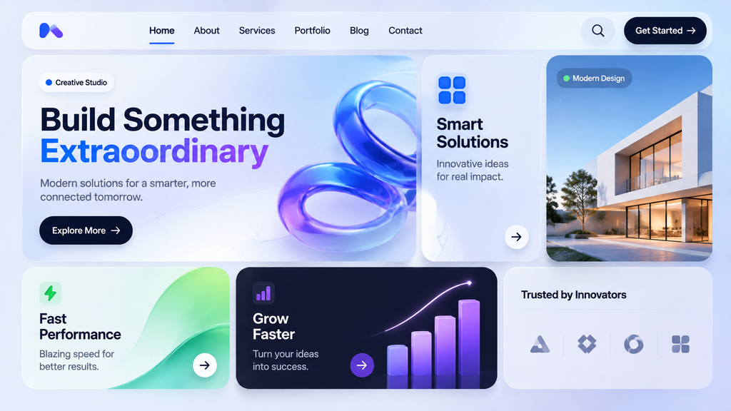
A website can contain a lot of information, but displaying everything in long paragraphs can make it difficult to explore. Bento grids offer a more organized way to present content through separate rectangular sections of different sizes.
Inspired by the compartments of a Japanese bento box, this layout divides a page into neat content blocks. Each block can highlight a different feature, service, image, statistic, or call to action.
This is one of the most practical new web design trends example because it combines visual appeal with clear information organization.
What Makes Bento Grid Layouts Effective?
A bento grid uses a modular structure to arrange content in a way that feels organized without making every section look identical.
Its common features include:
- Different card sizes: Larger cards highlight important content, while smaller ones present supporting information.
- Clear content sections: Each block focuses on one topic or feature.
- Flexible layouts: Designers can rearrange sections to suit different screen sizes.
- Visual variety: Images, icons, text, and graphics make each section easier to recognize.
For example, a software company’s homepage could use one large card to introduce its main product, another to show customer results, and smaller cards to explain integrations, pricing, and support.
Real-World Applications and Business Benefits
Product-focused websites, such as those created by Apple, demonstrate how separate visual sections can make product information easier to explore.
Businesses can use bento grids to highlight important services, customer reviews, product benefits, and company achievements without forcing visitors to read long blocks of text.
The layout can also improve content scanning. Visitors can quickly identify the sections that match their interests.
However, designers must consider mobile responsiveness. A grid that looks organized on a desktop can become crowded on a smaller screen. Cards should stack in a logical order, maintain readable text sizes, and avoid unnecessary visual complexity.
Best for: Corporate websites, SaaS platforms, e-commerce stores, portfolios, and technology businesses.
3. Kinetic & Bold Typography
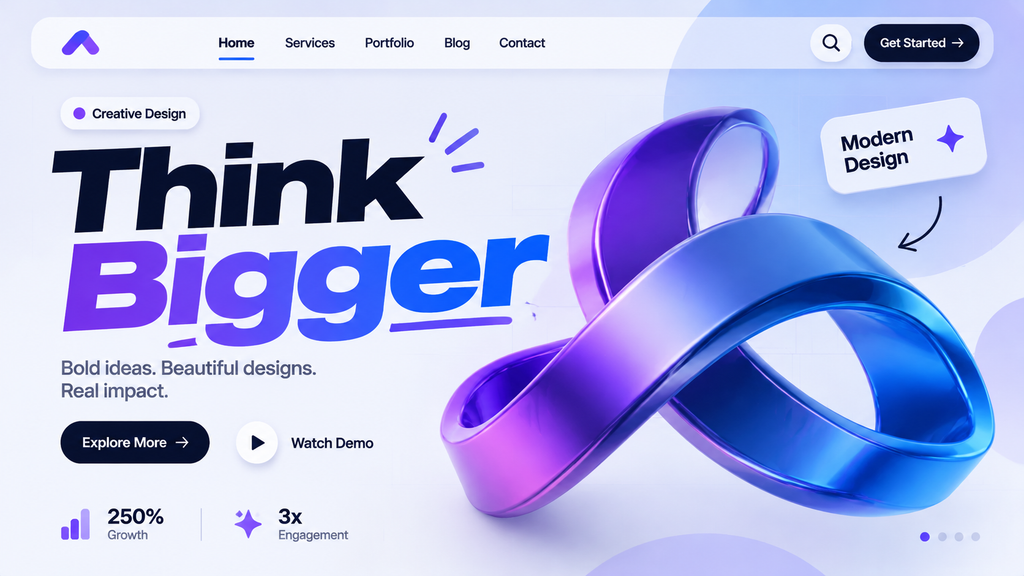
Typography is more than a way to display words. It helps communicate a brand’s personality, organize information, and guide visitors toward important content.
In 2026, designers are using larger headlines, expressive fonts, variable typography, and subtle text animations to make website messages stand out.
Kinetic typography takes this idea further by adding movement to text. Letters may appear gradually, change size, or respond to scrolling and user interactions.
How Bold Typography Improves Website Design
Bold typography helps visitors understand a website’s main message without searching through multiple sections.
For example, a creative agency might use a large headline such as “Build a Brand People Remember” to communicate its main value immediately.
Common techniques include:
- Oversized headlines: Use larger text to highlight important messages.
- Variable fonts: Adjust font weight, width, and style to create visual variety.
- Animated text: Introduce movement to important words or headings.
- Contrasting font combinations: Pair different font styles to create a clear hierarchy.
- Expressive letter spacing: Use spacing and alignment to strengthen the visual identity.
Real-World Examples and Business Benefits
Brands such as Nike often use strong typography in their digital campaigns to communicate energy, confidence, and movement.
A similar approach can help businesses create a recognizable online identity. A bold headline can introduce a service, highlight a product benefit, or encourage visitors to explore a landing page.
It also helps improve content hierarchy. When visitors can easily identify headings and supporting information, they can understand the page more quickly.
However, bigger text does not automatically mean better design. Headlines should remain readable on smaller screens, and animated text should not distract visitors from the actual message. Choose fonts that load efficiently and avoid excessive font variations.
Best for: Creative agencies, corporate websites, fashion brands, portfolios, and product landing pages.
4. 3D Elements & Mixed Media
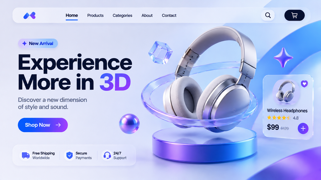
Flat images can explain a product, but sometimes visitors need a better understanding of its shape, features, and appearance. Three-dimensional elements and mixed media help create a more immersive experience by combining realistic visuals with traditional website content.
This approach uses 3D models, layered images, illustrations, video, and visual effects to make a website feel more interactive.
Common Features of 3D and Mixed Media Design
Designers use different techniques to add depth and visual interest to websites.
Some popular options include:
- Interactive 3D models: Allow visitors to rotate, zoom in, or explore products.
- Glassmorphism: Use translucent surfaces, soft backgrounds, and blur effects to create depth.
- Layered visuals: Combine photographs, illustrations, and graphic elements.
- 3D animations: Show how a product works or highlight its important features.
- Mixed media backgrounds: Blend video, photography, textures, and digital artwork.
Real-World Applications and Business Benefits
Example: Interactive product visualization for furniture shopping.
An online furniture store can use 3D product models to help customers explore a sofa from different angles. Some shopping experiences also use augmented reality to help visitors visualize furniture in their own rooms.
Similarly, an automotive website can use interactive vehicle models to show exterior details, interior features, and available customization options.
These experiences can help customers understand products before purchasing them. They also give brands more creative ways to present complex features.
However, 3D graphics can increase page weight and processing demands. Use optimized models, compressed images, and lazy loading. Provide static image alternatives when interactive content is unavailable or unsuitable for a device.
Best for: E-commerce stores, furniture retailers, automotive websites, technology brands, and creative portfolios.
5. Scroll-Triggered Motion & Micro-Interactions
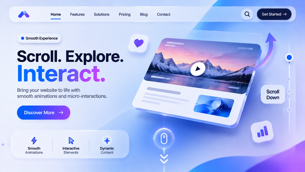
A website does not have to remain static while visitors explore it. Small animations and interactive effects can make browsing feel smoother, more engaging, and easier to understand.
Scroll-triggered motion activates visual elements as visitors move down a page. For example, images can fade into view, text can appear gradually, and background elements can move at different speeds. Micro-interactions are smaller effects that respond to specific actions, such as clicking a button, opening a menu, or submitting a form.
Both techniques help make a website feel more responsive without requiring visitors to learn complicated controls.
Popular Motion and Micro-Interaction Features
Designers use different animation techniques to guide visitors and provide useful feedback.
- Scroll animations: Reveal images, headings, and content as visitors move through a page.
- Hover effects: Change the appearance of buttons, links, or cards when users move their cursors over them.
- Button feedback: Show a small animation when someone clicks or presses a button.
- Loading indicators: Let visitors know when a form, page, or other feature is processing.
- Parallax effects: Move background and foreground elements at different speeds to create depth.
Real-World Examples and Business Benefits
Example: landonorris
Product storytelling pages demonstrate how scrolling and visual transitions can introduce product features step by step.
A digital marketing agency, for example, could reveal its services as visitors scroll through the homepage. An online store could use subtle hover effects to display product details or provide feedback when customers add items to their carts.
These small interactions can make website elements easier to understand. They also help visitors recognize when an action has been completed successfully.
However, motion should always serve a purpose. Too many animations can distract visitors, increase loading time, and create problems for people who prefer reduced motion. Use lightweight CSS animations where possible, avoid unnecessary JavaScript, and provide controls or reduced-motion alternatives.
Best for: Landing pages, creative portfolios, corporate websites, e-commerce stores, and product websites.
6. Neo-Brutalism & “Cute-alism”
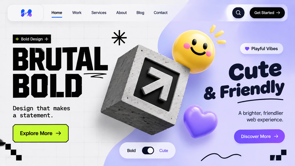
Many websites follow similar design patterns, which can make different brands look almost identical. Neo-brutalism and cute-alism offer a more expressive approach by using bold layouts, playful visuals, bright colors, and unusual design elements.
Although these styles have different characteristics, both focus on making websites feel more distinctive and memorable.
What Is Neo-Brutalism?
Neo-brutalism takes inspiration from brutalist architecture and traditional graphic design. It uses simple structures, strong borders, high-contrast colors, and sometimes deliberately rough visual elements.
Common features include:
- Thick borders and visible outlines.
- Large, bold typography.
- Bright or contrasting color combinations.
- Asymmetrical layouts.
- Simple shapes and unconventional spacing.
- Minimal decorative effects.
The goal is to create a website that looks confident and different rather than following traditional design conventions.
What Is Cute-alism?
Cute-alism brings a softer and more playful personality to website design. It combines cute illustrations, rounded shapes, friendly colors, and hand-drawn elements to create a welcoming experience.
Popular features include:
- Cartoon-style illustrations and characters.
- Soft color palettes and rounded buttons.
- Playful icons and decorative graphics.
- Hand-drawn elements and imperfect shapes.
- Friendly typography and informal visual details.
Real-World Applications and Business Benefits
Example: Duolingo’s playful visual identity and character-led design.
Duolingo demonstrates how playful illustrations and recognizable characters can give a digital brand a friendly personality.
A creative studio might use neo-brutalist layouts to show its originality, while a children’s learning platform could use cute-alism to make its website feel more welcoming.
These styles can help businesses stand out in crowded markets and create stronger emotional connections with visitors.
However, visual creativity should not come at the cost of readability. Avoid low-contrast text, confusing navigation, and decorative elements that compete with important information. Use playful visuals around clear content sections and keep important actions easy to recognize.
Best for: Startups, creative agencies, design portfolios, entertainment brands, children’s platforms, and lifestyle businesses.
7. Refined Minimalism & Intentional Whitespace
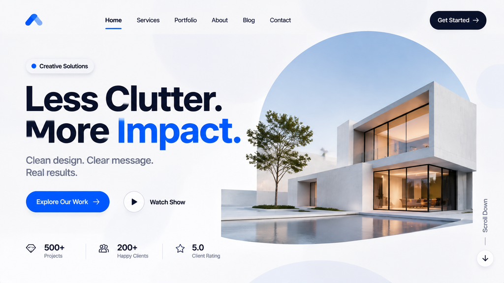
A website does not need dozens of colors, animations, and graphics to make a strong impression. Sometimes, removing unnecessary elements creates a better experience.
Refined minimalism focuses on presenting only the most useful content. It uses simple layouts, carefully selected colors, readable typography, and generous whitespace to help visitors focus on what matters.
Unlike basic minimalism, this approach does not mean removing everything. It means making every design element serve a clear purpose.
Key Features of Refined Minimalist Design
A minimalist website usually includes:
- Limited color palettes: Use a few colors that match the brand identity.
- Simple navigation: Keep menus clear and easy to understand.
- Intentional whitespace: Leave enough space around headings, images, and buttons.
- Clear typography: Use readable fonts and consistent heading sizes.
- Purposeful imagery: Include visuals that support the message instead of filling empty areas.
Whitespace does not have to be white. It simply refers to the empty space surrounding design elements.
Real-World Examples and Business Benefits
Apple is a familiar example of a brand that uses simple layouts, focused product imagery, and clear typography to present information without unnecessary distractions.
Professional service businesses can benefit from the same approach. A law firm’s website, for instance, can use a clean homepage to introduce its services, explain its experience, and provide an easy way to schedule a consultation.
A minimalist layout also makes it easier to highlight important calls to action. When visitors are not surrounded by competing elements, they can focus on the next step.
This approach can also support performance because fewer decorative assets and unnecessary animations may reduce page weight.
However, minimalism should not make a website feel empty or incomplete. Visitors still need useful information, clear navigation, and enough visual context to understand the business.
Best for: Corporate websites, professional services, SaaS businesses, consulting firms, and luxury brands.
8. Dark Mode & High-Contrast Palettes
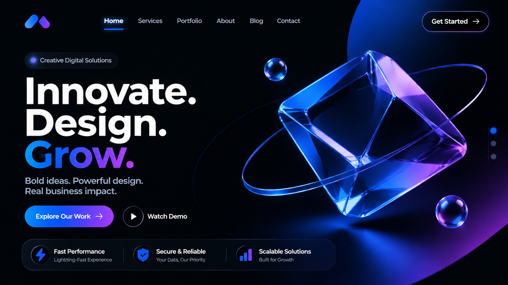
Dark mode has become a popular design choice for websites and digital products. Instead of using a bright background with dark text, this approach uses darker surfaces with lighter text and carefully selected accent colors.
It creates a different visual experience and can be particularly useful for websites that visitors use frequently or in low-light environments.
What Makes Dark Mode Effective?
A well-designed dark interface uses more than a black background. Designers need to choose suitable shades, text colors, borders, and highlights to maintain readability.
Some common features include:
- Dark backgrounds: Use charcoal, deep gray, or black surfaces.
- Light typography: Make important text easy to read against darker backgrounds.
- Bright accent colors: Highlight buttons, links, and important information.
- Subtle borders: Separate content sections without making the interface feel crowded.
- Theme switching: Allow visitors to choose between light and dark appearances.
Real-World Examples and Business Benefits
Example: Spotify’s dark interface and colorful visual accents.
Spotify uses a recognizable dark interface with colorful artwork and clear controls. This approach helps its content stand out while maintaining a consistent visual identity.
Technology companies, gaming platforms, and entertainment websites can use dark mode to create a similar experience.
For businesses, a dark theme can strengthen brand perception and make certain visual elements more noticeable. It can also give visitors more control over their browsing experience.
However, dark mode does not automatically reduce eye strain for everyone. Poorly selected colors can make text difficult to read, especially for people with certain visual needs.
Use tested contrast combinations, avoid overly bright text on pure black backgrounds, and check how images, forms, icons, and buttons appear in both themes.
Best for: SaaS platforms, technology companies, gaming websites, entertainment brands, and digital products.
9. Experimental & Non-Traditional Navigation
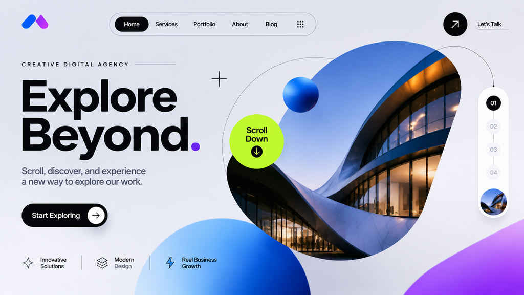
Navigation helps visitors move between pages and find important information. Most websites use familiar top navigation bars, dropdown menus, and side menus. However, some brands are experimenting with more creative ways to organize website navigation.
Experimental navigation uses unusual layouts, interactive menus, visual transitions, and spatial elements to create a more memorable browsing experience.
The goal is to make website exploration feel interesting while still helping visitors find what they need.
Popular Non-Traditional Navigation Techniques
Here are some ways designers are changing traditional website navigation:
- Full-screen menus: Display navigation links across the screen when visitors open a menu.
- Interactive navigation: Use animations and visual feedback to make menu interactions more engaging.
- Horizontal scrolling: Allow visitors to explore selected content by moving sideways.
- Spatial navigation: Arrange content in a visual environment that visitors can explore.
- Creative cursor interactions: Change cursor behavior to highlight clickable elements or provide navigation hints.
- Page transitions: Use smooth transitions to connect different sections of a website.
Real-World Applications and Business Benefits
Example: resn
Creative agencies and digital portfolios often use experimental navigation to showcase their design skills. Instead of presenting projects through a standard list, they might use interactive galleries, visual menus, or full-screen layouts.
A photography portfolio, for example, could allow visitors to explore projects through image-based navigation. A creative studio could organize its work into interactive sections that reveal details when selected.
These approaches can make a brand more memorable and encourage visitors to explore its content.
However, unusual navigation can also confuse people if it is not designed carefully. Visitors should always understand where they are, how to return to the previous page, and how to access important information.
Keep essential links visible, provide familiar navigation controls, and make sure the experience works with keyboards and touchscreens.
Best for: Creative agencies, photography portfolios, design studios, entertainment brands, and campaign websites.
10. Accessibility and Sustainable Design
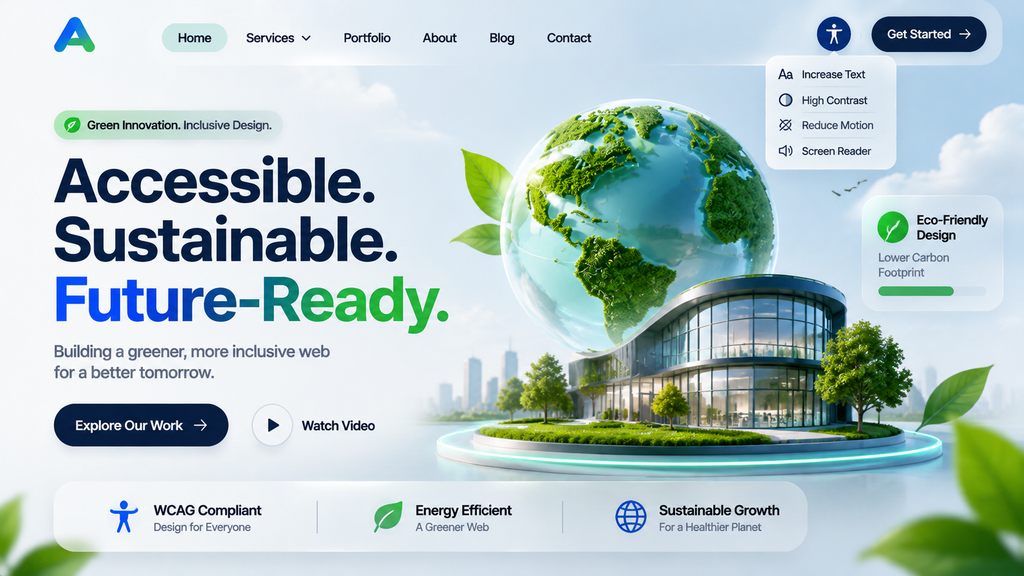
A modern website should work for as many people as possible while using resources efficiently. Accessibility and sustainable design bring these two goals together.
Accessibility focuses on making websites easier to use for people with different abilities. Sustainable design focuses on reducing unnecessary digital resources, improving efficiency, and creating lighter online experiences.
These practices are not just visual trends. They are important parts of responsible website development.
Key Features of Accessible Website Design
An accessible website allows visitors to navigate, understand, and interact with its content in different ways.
Important features include:
- Readable typography: Use suitable font sizes, spacing, and clear text.
- Color contrast: Make sure text and interactive elements stand out from their backgrounds.
- Keyboard navigation: Allow visitors to use important website features without a mouse.
- Alternative text: Describe meaningful images for people using screen readers.
- Clear form labels: Help visitors understand what information each field requires.
- Captions and transcripts: Make audio and video information available in alternative formats.
Designers should use the Web Content Accessibility Guidelines (WCAG) as a practical reference when planning and testing website accessibility.
How Sustainable Website Design Works
Sustainable design aims to reduce unnecessary data transfer and processing. A lighter website can also improve the visitor experience, particularly for people using slower internet connections or older devices.
Useful techniques include:
- Compressing images and using modern image formats.
- Removing unnecessary scripts and plugins.
- Choosing efficient fonts and limiting font variations.
- Using lazy loading for images and other non-essential media.
- Reducing unnecessary animations and large background videos.
- Working with efficient hosting and caching solutions.
Real-World Applications and Business Benefits
The GOV.UK website demonstrates how clear language, simple navigation, and consistent layouts can make digital information easier to access.
Businesses can apply similar principles to service pages, online stores, booking forms, and customer support sections.
For example, a healthcare website can use clear labels, readable text, keyboard-friendly forms, and accessible appointment booking. A retail website can provide descriptive product images and easy-to-use filters.
These improvements can help more people use the website, strengthen customer trust, and reduce unnecessary barriers.
Accessibility also needs regular testing. A website accessibility checklist can help teams review contrast, keyboard access, labels, headings, and alternative text before and after launch.
Best for: Every website, including corporate, healthcare, e-commerce, government, educational, and service-based websites.
A Real-World Example: Website Design for Rayne Aesthetic Spa
At American Design Agency LLC, we apply modern web design principles to projects with different audiences and business goals. One example is our work with Rayne Aesthetic Spa, a beauty and aesthetics business that needed a stronger online presence.
Our team designed and developed a stylish, mobile-friendly website that reflects the spa’s professional atmosphere and makes it easier for visitors to explore its treatments and learn about the brand. The project also included social media marketing to support a more consistent digital presence.
This project demonstrates an important principle of modern website design: visual appeal should work alongside usability and clear communication. For businesses in the beauty industry, a polished website should reflect the brand while helping potential clients find the information they need.
The takeaway: Choose design trends based on your audience and business objectives rather than adopting them simply because they are popular.
Make Every Website Interaction Count
Whether you want to improve navigation, increase engagement, or generate more leads, the right design strategy can make a real difference. Start turning modern web design ideas into meaningful business results.
Build a Better User ExperienceHow These Web Design Trends Affect User Experience and Business Performance
Following design trends is useful only when they improve the way people interact with a website. A visually attractive design may catch attention, but visitors also expect a smooth experience from the first click to the final action.
Here are six important areas where modern design choices can make a difference.
1. User Experience and Navigation
A good user experience helps visitors understand a website without unnecessary effort.
Bento grids organize information, minimalism reduces distractions, and micro-interactions provide helpful feedback. AI-powered personalization can also make content more relevant to individual visitors.
For example, a service-based business can use a simple homepage with clear service categories, customer testimonials, and a visible contact button.
The key is to make every page easy to explore. Visitors should never have to guess where to click or how to find important information.
2. Mobile Responsiveness
People access websites through smartphones, tablets, laptops, and desktop computers. A design that works only on a large screen can create problems for mobile visitors.
Responsive Web Design ensures that layouts, images, text, and navigation adjust to different screen sizes.
For example, a bento grid may display three columns on a desktop but stack into one column on a smartphone. Similarly, navigation menus may change into a compact mobile menu.
Businesses should test their websites on different screen sizes and devices to make sure buttons remain accessible, text stays readable, and important content does not disappear.
If a business needs expert help, Responsive web design services can support the development of layouts that adapt to different devices without sacrificing functionality.
3. Accessibility and Inclusive Experiences
Accessibility makes it possible for more people to use a website comfortably. It also encourages businesses to create clearer and more consistent digital experiences.
Prioritizing website accessibility helps businesses create inclusive digital experiences that allow visitors with different abilities to navigate and interact with their content.
For example, high-contrast colors help visitors read text, while descriptive form labels make it easier to complete online applications.
When planning a website, teams should review their website accessibility checklist and test important features using keyboards and screen readers.
A visually impressive website is not truly successful if some visitors cannot access its content or complete important actions.
4. Website Performance and Loading Speed
Modern design features can make websites more engaging, but some also increase loading time.
Large 3D models, autoplay videos, heavy animations, and oversized images can slow down a website if developers do not optimize them.
Businesses should monitor Core Web Vitals, including:
- Largest Contentful Paint (LCP): Measures how quickly the main content becomes visible. A good result is 2.5 seconds or less.
- Interaction to Next Paint (INP): Measures how quickly a page responds to user interactions. A good result is 200 milliseconds or less.
- Cumulative Layout Shift (CLS): Measures unexpected layout movement. A good result is 0.1 or less.
These metrics should be evaluated at the 75th percentile of page visits, separately for mobile and desktop users.
Using compressed images, efficient code, caching, and lazy loading can help maintain a smooth experience.
5. Brand Perception and Trust
A website often creates the first impression of a business. Its design can influence whether visitors see a company as professional, reliable, creative, or outdated.
For example, a financial consulting company may benefit from refined minimalism and professional typography. A gaming brand might use dark mode, colorful accents, and interactive visuals to reflect its personality.
The important thing is consistency. Colors, fonts, images, navigation, and messaging should work together to communicate the same brand identity.
6. Conversions and Customer Engagement
A well-designed website should help visitors take meaningful actions, whether that means purchasing a product, requesting a quote, booking an appointment, or contacting a business.
Clear calls to action, relevant recommendations, easy navigation, and useful product information can reduce friction throughout the customer journey.
For example, an e-commerce website can combine personalized recommendations with interactive product previews to help customers make informed decisions.
Similarly, a professional services website can use clear service descriptions and visible consultation buttons to encourage inquiries.
Design trends should support these actions rather than distract visitors from them.
Which Web Design Trends Are Best for Different Types of Businesses?
Not every business needs the same website features. A trend that works well for an online store may not be suitable for a law firm or a small local business. The best approach is to choose design features based on your audience, industry, website goals, and available budget.
Before implementing advanced design features, businesses should also consider their website design cost, including development requirements, ongoing maintenance, and the resources needed to support interactive elements.
Here’s how different businesses can use the 10 trends effectively.
| Business Type | Recommended Trends | Why They Work |
| Startups | AI personalization, bold typography, bento grids, micro-interactions | Help new brands stand out and communicate their value quickly. |
| Small Businesses | Refined minimalism, responsive design, accessibility, bold typography | Create professional websites that are easy to navigate and maintain. |
| E-commerce | AI personalization, 3D elements, bento grids, dark mode | Improve product discovery and help customers make buying decisions. |
| Corporate Websites | Bento grids, refined minimalism, accessibility, AI personalization | Organize complex information and maintain a professional brand image. |
| Service-Based Businesses | Minimalism, micro-interactions, accessibility, bold typography | Highlight services, build trust, and encourage visitors to request consultations. |
Trends for Startups
Startups need websites that explain their products or services quickly. Bold typography, modular layouts, and AI-powered personalization can help communicate their value and create a distinctive brand identity.
However, startups should avoid investing heavily in complicated animations or 3D experiences before establishing their main website goals.
Trends for Small Businesses
Small businesses often have limited budgets and resources. They should prioritize responsive layouts, simple navigation, accessibility, and clear calls to action.
Refined minimalism is particularly useful because it helps businesses present their services professionally without requiring complicated visual effects.
Trends for E-Commerce Websites
Online stores can benefit from AI recommendations, interactive product previews, and organized bento layouts. These features help customers discover products, compare options, and understand product details.
However, product pages should remain fast, mobile-friendly, and easy to navigate.
Trends for Corporate Websites
Corporate websites often contain multiple services, departments, resources, and customer information. Bento grids and refined minimalism can make this information easier to organize.
Accessibility and consistent design systems are also important for maintaining a professional experience across different pages.
Trends for Service-Based Websites
Service providers need to build trust and explain why customers should choose them. Clear typography, simple layouts, useful micro-interactions, and accessible contact forms can support these goals.
For example, a consulting company can use a clean homepage, organized service sections, customer testimonials, and a prominent consultation CTA.
How to Adopt New Web Design Trends Without Hurting Website Performance
Following the current website design trends can help businesses create more engaging websites, but adding too many features can cause problems.
A website filled with animations, oversized images, complicated navigation, and unnecessary interactive elements may look impressive but become difficult to use.
Here are six practical ways to adopt trends without compromising performance or usability.
1. Start With Your Website Goals
Before selecting a design trend, understand what your website needs to achieve.
Businesses planning a website redesign should first identify outdated features, usability issues, and areas where modern design improvements can better support their goals.
A website redesign checklist can help businesses review their existing content, navigation, mobile experience, accessibility, and performance before starting the redesign process.
Are you trying to generate leads, sell products, build brand awareness, or provide information?
For example, an online store may benefit from interactive product previews, while a consulting website may need a simple layout with clear service information.
Choose features that support these goals rather than adding effects simply because they are popular.
2. Prioritize Mobile-First Design
Designing for mobile devices first helps ensure that important website features work on smaller screens.
Test your layouts on smartphones and tablets before finalizing the desktop version. Check whether text is readable, buttons are easy to tap, and menus are simple to open.
A responsive layout should adapt naturally instead of simply shrinking the desktop design.
Developers can use CSS Grid and Flexbox to create flexible layouts that adjust to different screen sizes. Responsive typography and appropriately sized images also help maintain readability and visual consistency across smartphones, tablets, and desktop screens.
3. Keep Visual Effects Lightweight
Animations and 3D elements can increase website loading time when they are not optimized.
Use compressed images, lightweight animation techniques, and optimized media files. Avoid loading large interactive elements before visitors need them.
For example, a 3D product model can load when someone opens the product section rather than slowing down the initial homepage experience.
For advanced 3D experiences, developers can use WebGL to render interactive graphics in the browser. However, these elements should be optimized through efficient models, compressed textures, and controlled loading. For simpler visual effects, lightweight CSS animations may provide a better balance between appearance and performance.
4. Make Accessibility Part of the Design Process
Accessibility should not be something businesses fix after launching their websites.
Use readable fonts, suitable color contrast, descriptive links, keyboard-friendly navigation, and properly labeled forms from the beginning.
Test important interactions with different input methods and assistive technologies.
Developers should also respect the prefers-reduced-motion setting so visitors who prefer less animation can experience the website comfortably. Visible keyboard focus states, accessible form controls, and logical navigation order are equally important for supporting visitors who use assistive technologies.
5. Maintain Consistent Branding
Not every trend will match your brand identity.
A professional financial services website may not benefit from bright neo-brutalist colors, while a creative portfolio might look too ordinary with a strictly minimalist design.
Choose colors, typography, layouts, and interactive elements that reflect your brand personality.
Consistency helps visitors recognize your business and understand what it offers.
6. Test and Improve After Launch
Launching a new design is not the end of the process. Businesses should monitor how visitors interact with the website and identify areas that need improvement.
Use analytics, user feedback, performance reports, and usability testing to understand whether new features are helping.
If an animation slows down a page or a navigation layout confuses visitors, adjust it. A successful design should continue improving as customer expectations change.
Testing should also cover browser compatibility, keyboard navigation, responsive layouts, and Core Web Vitals. Combining performance reports with usability testing helps identify technical problems that may affect the visitor experience.
Ready to Build a Modern Website That Stands Out?
Keeping up with modern website design is important, but choosing the right features matters even more. Your website should reflect your brand, meet your visitors’ expectations, and make it easy for potential customers to take action.
Whether you need a new website or want to improve an existing one, the right design strategy can help you create a faster, more accessible, and engaging online experience.
With Professional Web Design Services from American Design Agency LLC, you can turn modern design ideas into a website that supports your business goals. From responsive layouts and custom visuals to user-friendly navigation and website development, the focus should always be on creating a digital experience that works for your customers.
Ready to Build a Website That Stands Out in 2026?
Your website should do more than follow the latest trends. It should reflect your brand, engage your audience, and support your business growth. Whether you’re planning a complete redesign or looking to improve your existing website, now is the perfect time to create a digital experience that makes a lasting impression.
Start Your Website TransformationFrequently Asked Questions
AI-powered experiences, bold typography, bento grids, and interactive design are among the popular directions in 2026. Businesses are using these features to create more personalized, visually engaging, and user-friendly websites. However, accessibility and performance remain essential for a successful design.
Start with a clean layout, clear navigation, readable typography, and high-quality images. Use a consistent color palette, add subtle micro-interactions, and make sure your website works well on mobile devices. You can also introduce modern features such as bento grids, organic shapes, and personalized content, depending on your brand and audience.
Responsive design allows a website to adjust to different screen sizes, including smartphones, tablets, and desktop computers. It makes content easier to read, navigation simpler, and buttons easier to use. It also supports a consistent experience across devices and helps businesses serve visitors who primarily browse on mobile.
The 10 major trends covered in this guide are AI-powered experiences, bold typography, 3D visuals, micro-interactions, organic layouts, retro-inspired design, bento grids, glassmorphism, accessibility-first design, and performance-first design. Together, they focus on creating websites that are more engaging, inclusive, visually distinctive, and technically efficient.
Small businesses can benefit most from responsive layouts, accessible design, fast-loading pages, clear typography, and useful micro-interactions. These features improve the browsing experience without requiring complicated technology. Organic layouts can also help smaller brands create a recognizable identity while keeping the website simple and professional.
There is no fixed redesign schedule for every business. Many websites benefit from a major review every two to three years, but smaller improvements should happen more regularly. Review your website’s performance, mobile experience, security, accessibility, and customer feedback at least once or twice a year. Consider a full redesign when the current website no longer supports your business goals or provides a good user experience.
