


A landing page is the first handshake of your online offerings to potential clients. When someone clicks your ad, email, social post, or search result, this page is often their first real experience with your business.
If it feels clear and trustworthy, they stay. If it feels confusing, slow, or crowded, they leave.
That is why landing page design best practices matter. A landing page is not just a pretty looking web page. It has one job that is to help visitors understand your offer and take the next step.
That step could be buying a product, booking a call, downloading a guide, joining a list, or requesting a quote.
The best pages quickly explain the purpose of the offer, show why it matters to the visitor, build enough trust to reduce hesitation, and make the next step clear from the start.
This blog post shows how to design pages that turn more visitors into customers without sounding pushy.
What Makes a Landing Page Different from a Regular Website Page?

A regular website page often gives people many paths. A homepage may show services, products, blog posts, company details, testimonials, and contact links. That is useful when visitors want to explore.
A landing page is different because it focuses on one goal. It is usually made for one campaign, one audience, and one action. For example, a page may invite visitors to start a free trial, download a checklist, register for a webinar, or book a consultation.
Think of a website as a full shopping mall and a landing page as one clear store entrance.
Start with One Clear Conversion Goal
Before you write or design anything, decide what you want the visitor to do. This shapes the whole page. A page that asks people to buy, subscribe, read more, follow on social media, and contact sales at the same time can feel messy.
A strong page gives visitors one main action that is, if the goal is to book calls, explain why the call is valuable. If the goal is to sell a product, focus on benefits, proof, and a smooth buying experience.
This is one of the most important landing page design best practices because a clear goal creates a clear page. Once the goal is set, the headline, images, buttons, form, and layout become easier to plan.
Write a Strong Headline That Instantly Communicates Value
Your headline is the first big message visitors see. It should tell them what you offer and why it matters. A good headline does not need to be clever. It needs to be clear.
For example, “Get More Leads from Your Website” is stronger than “Smart Digital Growth Solutions.” The first line gives a clear result. The second sounds nice, but it is harder to understand.
A strong headline usually focuses on a benefit. It may promise to save time, reduce stress, increase sales, improve results, or make a task easier. Keep it short and direct.
Create a Hero Section That Grabs Attention Quickly

Hero section is basically the top part of the landing page. It usually includes a headline, short supporting text that gives a quick idea to the visitor, a CTA button, and a visual related to your offer. This section must work accurately because visitors decide quickly whether a page feels useful or not
A good hero section answers three questions: What is being offered? Who is it for? What should I do next? For example, a design agency could say, “High-Converting Websites for Growing Businesses,” followed by “Book a Free Strategy Call.”
The visual should support the message. A software page can show a dashboard screenshot. A product page can show the product in use. Good visuals make the offer easier to understand.
Use Persuasive Copy That Speaks to Customer Pain Points
Persuasive copy is not about tricks. It is about showing people that you understand their problem and can help solve it. Most visitors arrive because they want something fixed, improved, saved, or made easier.
A business owner may get traffic but no leads. A customer may want a faster way to finish a task. A busy team may be tired of messy systems. Your copy should speak to these problems simply.
Then show how your offer helps. Do not only list features. Explain the benefit behind each feature. Instead of “Includes automated reports,” say, “See your weekly progress without spending hours building reports.” Among all landing page design best practices, this one builds trust because people act when they feel understood.
Design Clear and Action-Oriented CTAs
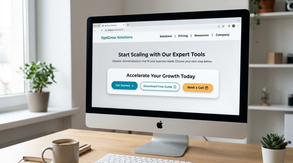
A call-to-action, or CTA, tells visitors what to do next. It may say “Get a Free Quote,” “Start Your Trial,” “Download the Guide,” or “Book a Call.” The best CTA text is clear and specific.
Avoid weak button text like “Submit” or “Click Here” when you can say something more useful. “Get My Free Checklist” feels more helpful than “Submit.” “Schedule a Demo” tells the visitor exactly what will happen.
Place CTAs where they naturally fit: near the top, after the benefits, and near the end for readers who need more details first.
Keep the Layout Clean, Focused, and Easy to Scan
Most visitors scan the overall appearance of your landing page before they read. They look at headings, buttons, images, short paragraphs, and important phrases. If the page feels crowded, they may leave before they understand your offer.
A clean layout gives every section room to breathe. Use short text blocks, clear headings, simple spacing, and a logical flow. Do not force too much information into one screen.
This is where design and writing work together. The design guides the eyes, while the words guide the decision. A clean page does not mean an empty page. It means every part has a purpose. This is one of those landing page design best practices that can improve results quickly.
Build Trust with Social Proof and Credibility Signals
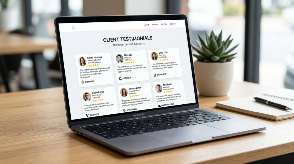
Nowadays, people are very careful online, even before they share an email, book a call, or buy something, they want to know if they can trust you. Social proof helps answer that question.
Testimonials, reviews, client logos, star ratings, case studies, and customer stories can make a page feel safer and give it a trustworthy touch. which shows that real people have trusted you before so they can trust.
Numbers can also build trust when they are honest. “Trusted by 500+ small businesses” feels stronger than “Trusted by many companies.” Place proof near your claims, benefits, or CTA sections so it supports the message naturally.
Make Forms Simple and Friction-Free
Forms are small, but they can make or break conversions. If a form asks for too much information too soon, visitors may stop. Nobody wants to fill out a long form just to get a simple guide.
Ask only for what you truly need. A newsletter signup may need only an email address. A project quote form may need a few more details.
Use clear labels, simple fields, and mobile-friendly spacing. A short privacy note can also reduce worry. Even a line like “We will not spam you” can make the form feel safer.
Optimize Landing Pages for Mobile Users
Most of the visitors will see your landing page on a smart phone. If it only looks good on desktop, you may lose a large part of your audience. Mobile users need readable text, easy buttons, fast loading, and simple forms.
Your headline should fit nicely on a small screen. Buttons should be big enough to tap. Images should load quickly and not push important content too far down.
Mobile design is part of the customer experience. When a page works well on a phone, your business feels modern and easy to deal with. That is why mobile optimization belongs in every list of landing page design best practices.
Improve Page Speed for Better User Experience and Conversions
A slow landing page can lose visitors before they even see your offer. People do not like waiting, especially on mobile. If a page takes too long to load, they may go back and choose another option.
Load Speed also affects how professional your brand feels. A fast page feels smooth, reliable, and easy. A slow page can make even a great offer feel weak.
The basics are simple. Compress large images. Remove scripts and plugins you do not need. Avoid heavy animations that do not add value. Keep the design clean and the code lightweight.
Use Visual Hierarchy to Guide Visitors Toward Action
Visual hierarchy means arranging the page in an optimized way so people notice the most important things first. Big headings, clear spacing, strong buttons, and simple section order all help guide the visitor.
A good landing page feels like a story. It grabs attention, explains the problem, presents the solution, builds trust, and invites the visitor to act.
One of the smartest landing page design best practices is to make the page easy to understand without making visitors work hard. Important buttons should stand out. Key benefits should be easy to find. Extra details should support the page, not bury the main message.
Add Urgency Without Sounding Pushy
Urgency can help people act faster, but only when it is real, not a trick to grab their attention. A discount for limited time, seasonal offer, or limited number of consultation spots can give visitors a reason to move forward and book that call right away.
Fake urgency can also damage trust and if a countdown timer resets every time someone visits, people may feel tricked. If every offer says “last chance” but never ends, the message loses power.
Good urgency does not scare people. It simply explains why now is a smart time to act. It respects the visitor while helping them make a decision.
Test, Track, and Improve Your Landing Page Over Time
Even a good landing page can become better. The first version is not always the best version. Testing helps you learn what your audience actually responds to.
You can test the headlines, CTA text, hero images, form length, section order, testimonials, and offers. Sometimes a small change can improve results. For example, “Get My Free Quote” may get more clicks than “Submit” because it sounds valuable.
Track numbers like conversion rate, bounce rate, scroll depth, button clicks, and form submissions. These numbers show where people are interested and where they may be getting stuck. Over time, landing page design best practices become stronger when you combine them with real visitor data.
Common Landing Page Design Mistakes to Avoid

Even experienced design teams make landing page mistakes, but that can be easy to fix once you are able to notice them. A helpful landing page should feel like a clear path, not a puzzle.
Watch out for these common mistakes:
- Using too many CTAs that ask visitors to do different things
- Writing vague copy that does not explain the real benefit
- Adding too many images, popups, colors, or animations
- Asking for too much information in the form
- Leaving out reviews, testimonials, or proof
- Forgetting to test the page on mobile
- Making the page slow with large files or unnecessary plugins
The easiest way to avoid these mistakes is to ask, “Does this help the visitor take the next step?” If the answer is no, the element may not belong on the page.
Conclusion
A high converting landing page is not just about the tricks, noise, or fancy effects. It is about helping people make a clear and confident decision. Every heading, image, paragraph, button, and form should support that decision.
When visitors do not feel confused or pressured, they are more likely to become leads, buyers, or booked calls.
Start with the basics. Set one clear goal and write a helpful yet informative headline. Show the real value that is being provided and use proof to gain potential clients trust. Keep the page fast, clean, and mobile-friendly.
These landing page design best practices can turn a plain page into a focused conversion tool that helps both your business and your customers.
Frequently Asked Questions
Landing page design best practices are the rules and techniques used to make a landing page clear, attractive, trustworthy, and easy to act on. These include using a strong headline, a clear call-to-action, simple copy, fast loading speed, mobile-friendly design, trust signals, and a layout that guides visitors toward one main goal.
A high-converting landing page clearly explains the offer, shows why it matters, builds trust, and makes the next step easy. It focuses on one goal instead of distracting visitors with too many choices. Strong headlines, benefit-focused copy, simple forms, social proof, and well-placed CTA buttons all help increase conversions.
A landing page should have enough sections to answer the visitor’s main questions without making the page feel too long or crowded. Most landing pages include a hero section, benefits, features or offer details, social proof, a form or CTA, and a final reminder to take action. The right number depends on the offer, audience, and how much information visitors need before deciding.
The most important element of a landing page is the main message, especially the headline and call-to-action. The headline tells visitors why they should care, while the CTA tells them what to do next. If these two elements are unclear, even a beautiful design may not convert well.
You can improve landing page conversion rates by making the page clearer, faster, and easier to use. Start by improving the headline, simplifying the copy, strengthening the CTA, reducing form fields, adding testimonials, and making sure the page works smoothly on mobile. Testing different versions of headlines, buttons, images, and forms can also help you find what works best.
In most cases, landing pages should not have full navigation menus because they can distract visitors from the main goal. A landing page works best when it keeps attention on one action, such as signing up, buying, booking a call, or downloading a resource. However, some longer or higher-trust offers may use simple anchor links to help visitors move between sections.
A good call-to-action is clear, specific, and action-focused. Instead of using vague text like “Submit” or “Click Here,” use phrases that tell visitors what they will get, such as “Get a Free Quote,” “Start Your Free Trial,” “Book a Free Call,” “Download the Guide,” or “Claim Your Offer.” The best CTA feels helpful, not pushy.
A landing page should be as long as it needs to be to explain the offer and help visitors feel confident. A simple offer may only need a short page, while a costly product or service may need more details, proof, and answers to common concerns. The key is not the length itself, but whether every section adds value and moves the visitor closer to action.
Need Landing Pages That Actually Convert Visitors into Customers?
A great landing page is more than design, it follows proven landing page design best practices that guide users from interest to action.
Our creative design services help businesses build high-converting landing pages that are clear, focused, and designed to turn clicks into real customers. From compelling headlines to persuasive CTAs and trust-building layouts, every page is created with strategy and performance in mind.
Whether you’re running ads, promoting a service, or generating leads, we help you create landing pages that improve results and boost conversions.
Book your free project consultation call
